Feat UX/UI — Support Queue — Omnichannel Chat
We reduced ~30s delays between customer arrival and first human contact through two targeted improvements: waiting-time queue ordering and a pop-up for immediate assignment.
Analysis & Results
We identified ~30s delay between customer arrival and first human contact. To reduce it, we combined two targeted improvements — waiting‑time queue ordering and a pop‑up for immediate assignment.
Our goal was to make the experience smoother for both customers and agents, aiming to reduce response time by ≥20% without increasing UI complexity or agent workload.
Project Context
The Queue Management Challenge
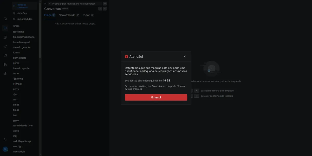
During our research, we discovered a critical issue that was impacting both customer satisfaction and agent efficiency: agents were missing important alerts due to insufficient visual emphasis and notification systems.
The existing solution relied heavily on sound alerts and subtle queue refreshes, but our analysis revealed that 63% of sound alerts did not result in a click, indicating a significant gap in the notification system.
"I only notice the ticket when I return to the Conversations tab. Too much time has already passed."— Agent, field test
Missed alerts
Agents missed the sound alert or were in another tab
Low visual emphasis
Queue refresh didn't draw enough visual attention
Negative impact
Wait spikes, CSAT drop, and ticket reopens
Log Analysis
of sound alerts did not result in a click, indicating agents were not perceiving or responding to alerts
average delay between arrival and first contact, causing frustration and impacting experience
Our Solution Approach
Based on our research findings, we developed a targeted solution that addressed the core issue: agents needed immediate, visible notifications that couldn't be missed, regardless of their current tab or focus state.
🎯 Goal
Reduce time to first human contact by ≥ 20% without increasing UI complexity or agent workload.
💡 Design Hypothesis
Showing a persistent, actionable pop-up as soon as there is an eligible ticket enables faster acceptance, removing the need to manually check queues.
Market Benchmark
Zendesk
CTA toasts
Intercom
Persistent notifications
Crisp
Assignment pop-ups
Analysis: major competitors use CTA toasts for support notifications.
🔧 How we'll do it
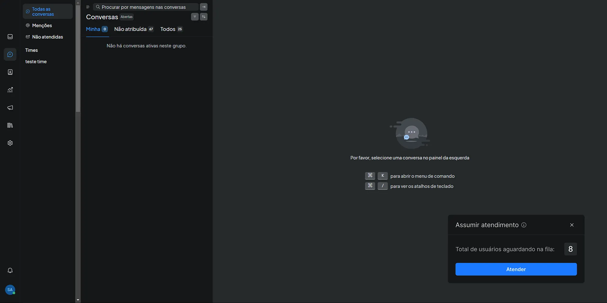
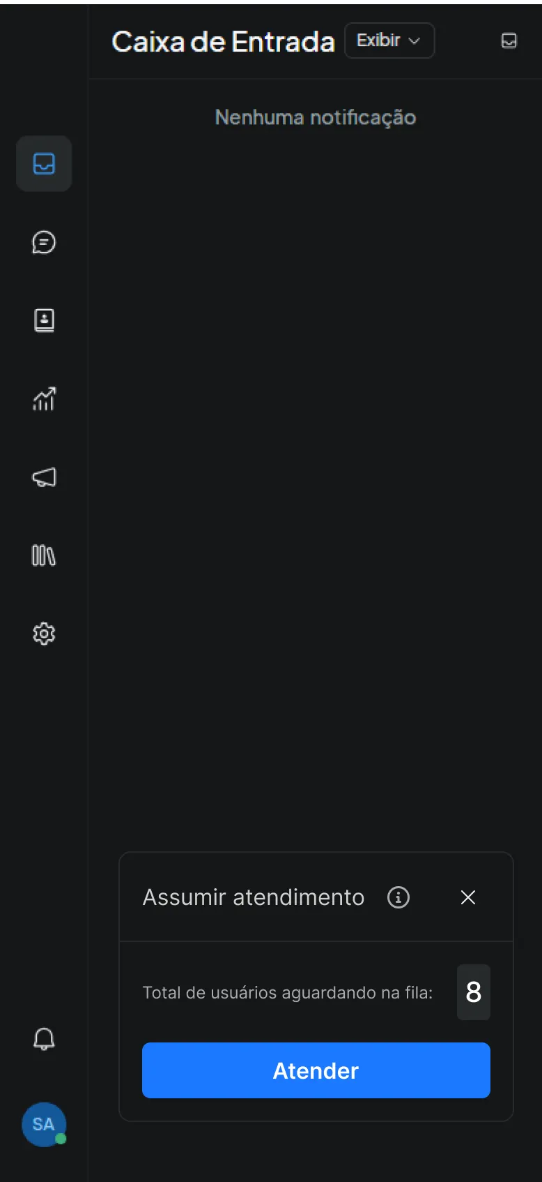
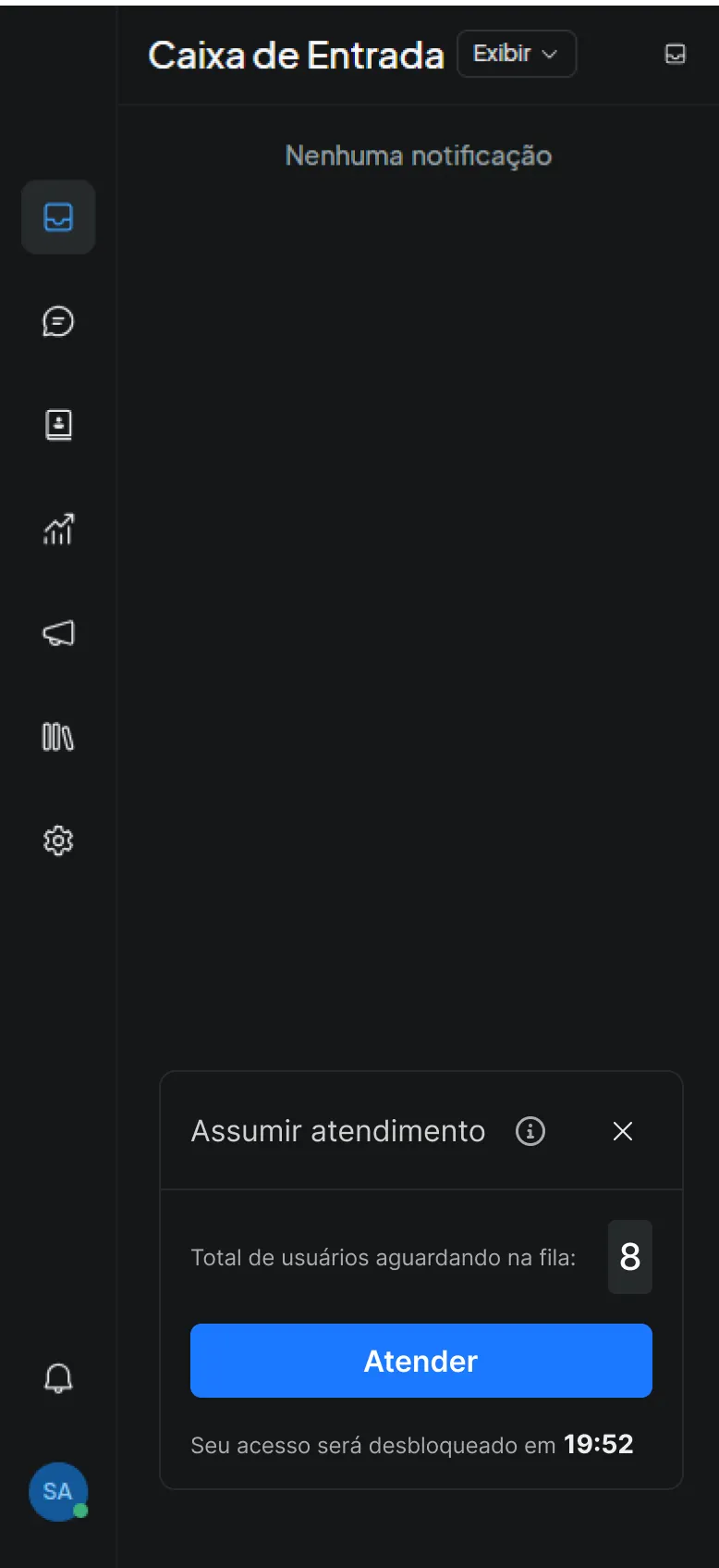
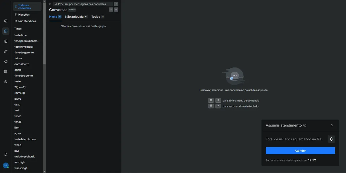
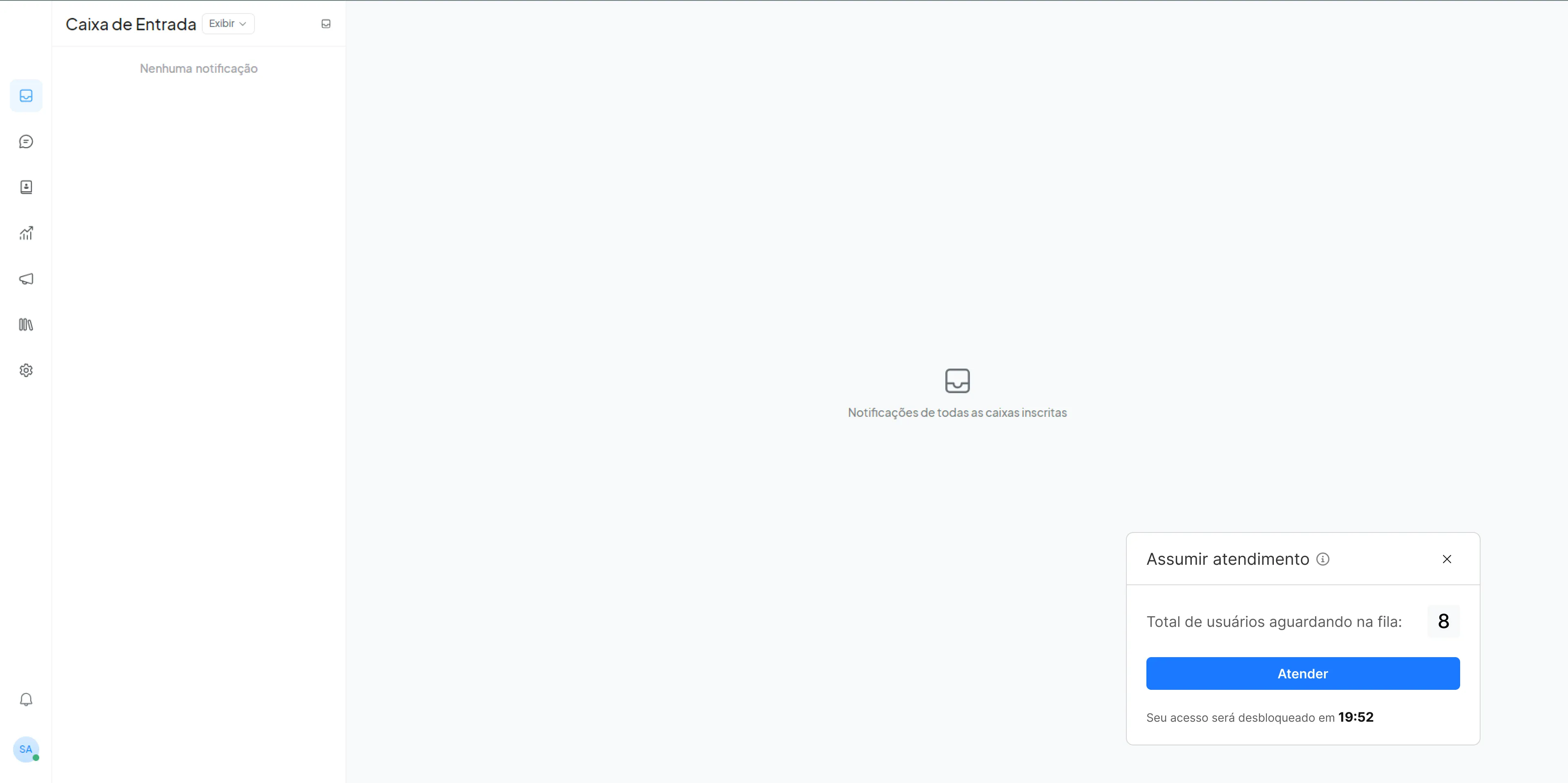
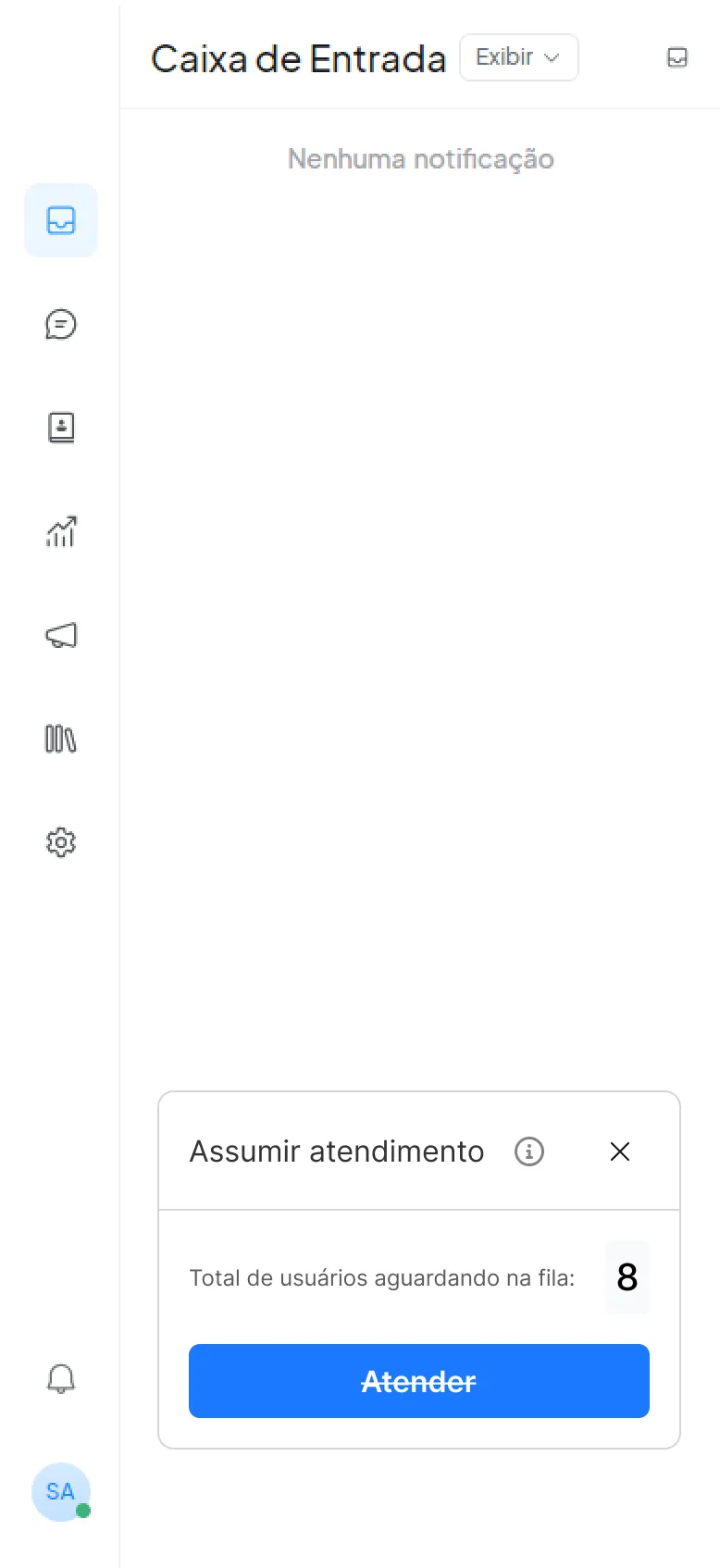
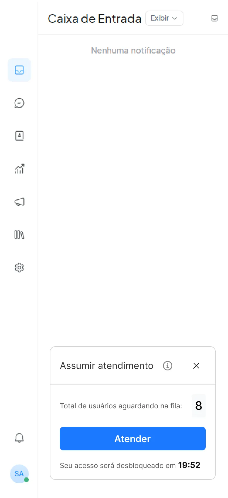
- ✓Bottom-right anchored pop-up
- ✓"Queue: 8" badge + live timer
- ✓Primary CTA "Accept"
- ✓Respects safe areas on mobile
⚙️ Business Rules
- •Trigger: ≥1 ticket and agent under active‑chat limit
- •Optimistic lock to prevent conflicts
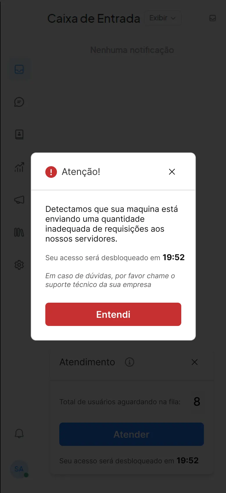
- •Pop-up expires in 15 seconds
- •Maximum of 3 pending pop-ups
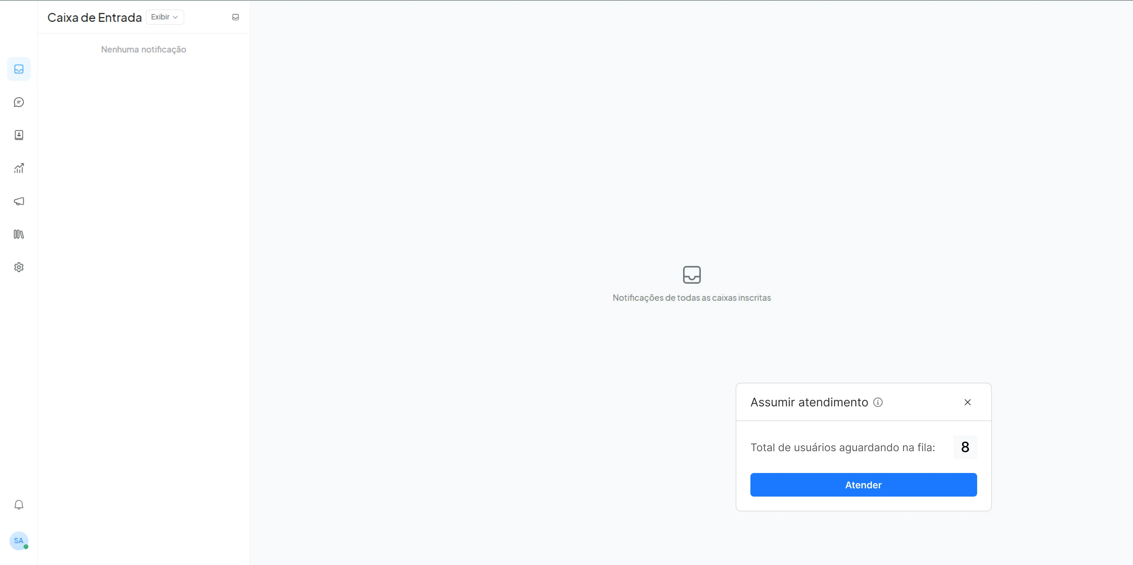
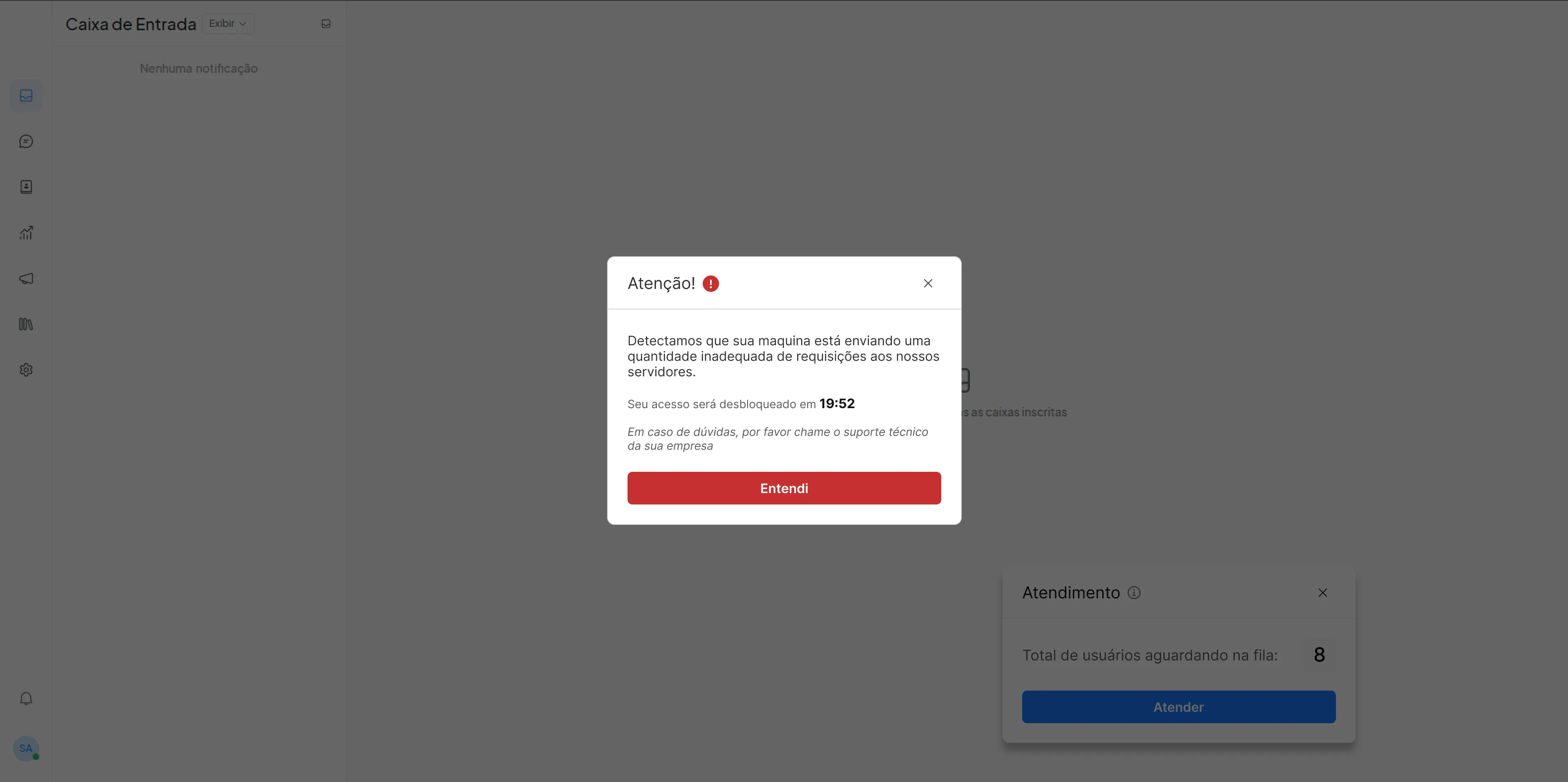
Interface & Features
Our solution focused on creating a persistent, actionable notification system that would immediately capture agent attention and provide clear actions for ticket assignment.
Ideation & Wireframes
Final pop-up design
Bottom-right anchored pop-up with "Queue: 8" badge, live timer and primary "Accept" button.
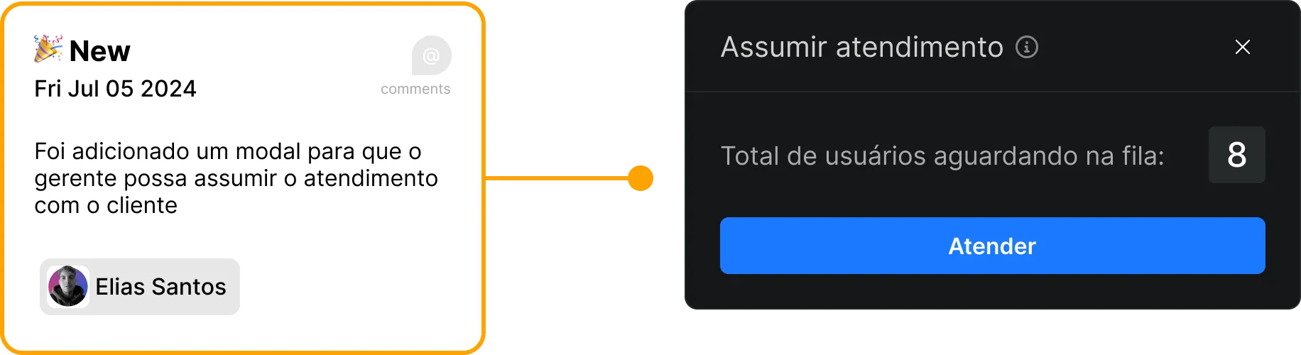
Different variations and states of the pop-up component.
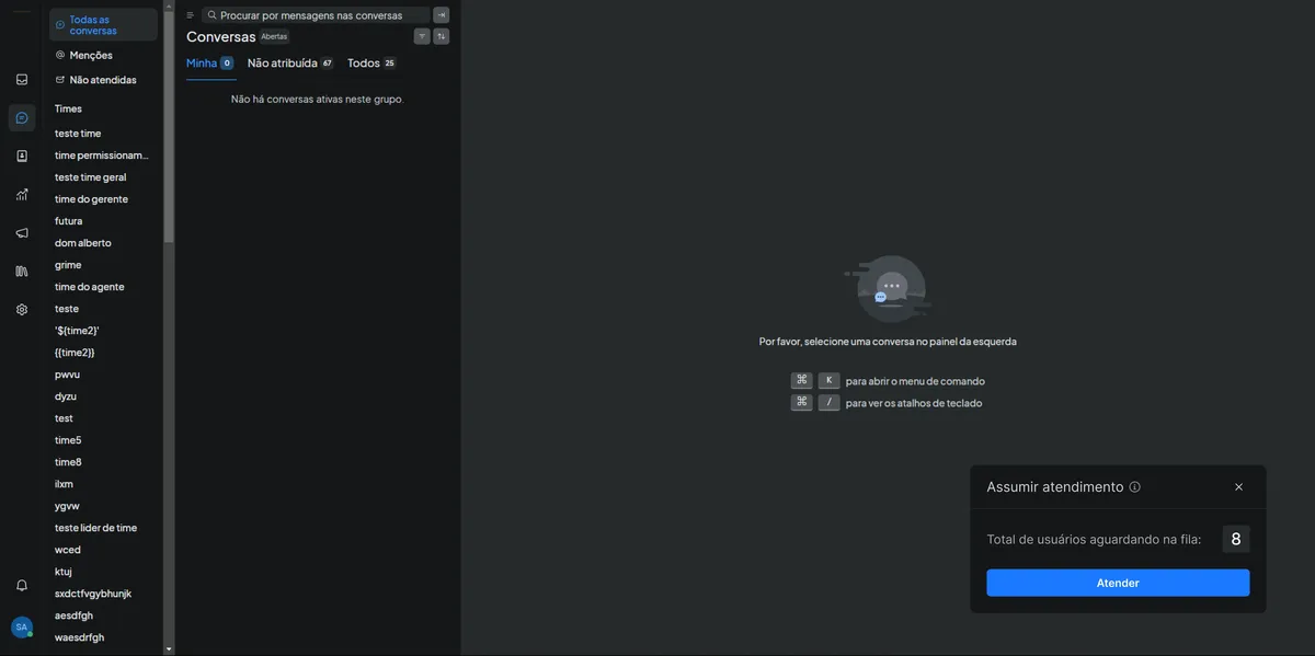
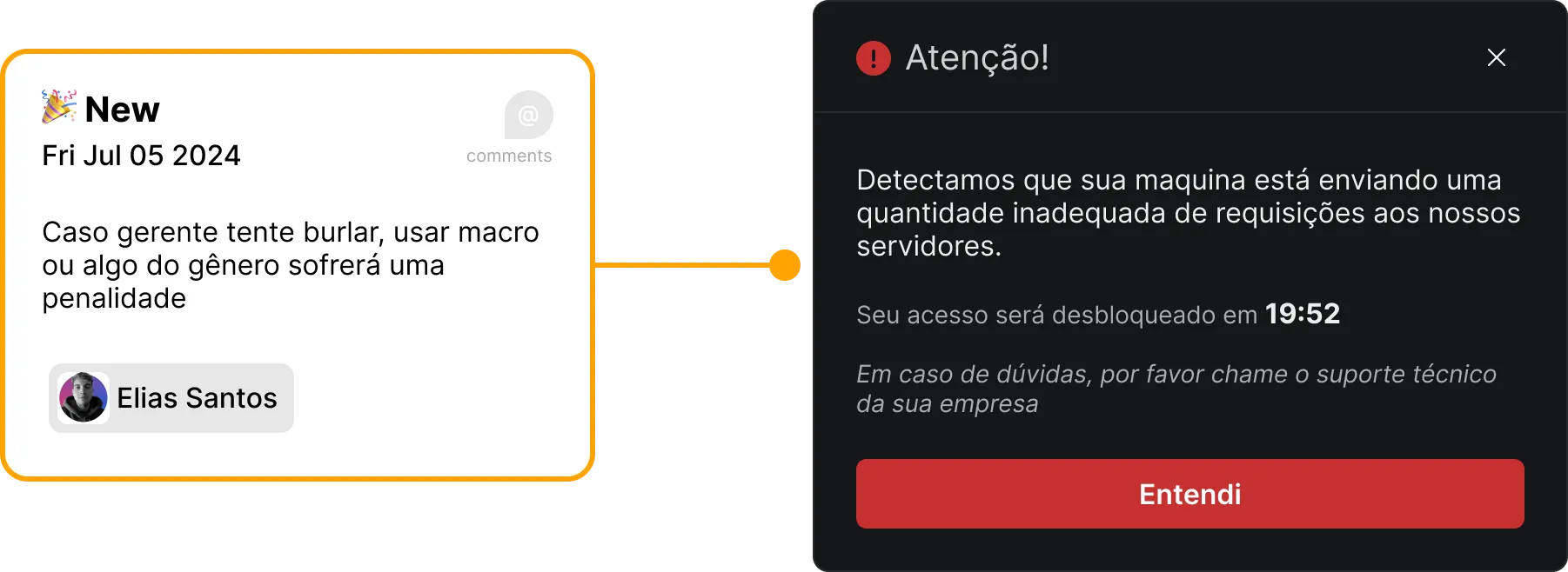
Additional states and configurations of the interface.
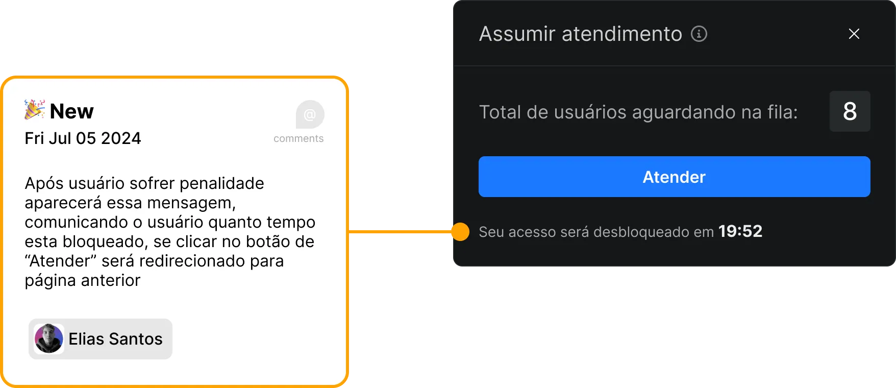
Light mode variations and final interface states.
Requirements Mapping & Testing
Our UX process focused on iterative development and continuous validation, ensuring that each design decision was backed by research and user feedback.
📋 Requirements mapping
🎯 Technical specifications
- User: online agents (Attendant+ profile)
- Trigger: ≥1 ticket and agent under active‑chat limit
- Content: title, queue counter, waiting time, Accept CTA
- Actions: Accept (primary), Ignore, "x" close
⚙️ Business rules
- Optimistic lock: prevents double assignment
- Expiration: pop‑up expires in 15 seconds
- Limit: maximum 3 pending pop‑ups
- Performance: appears in < 500ms
✅ Acceptance criteria
- • Pop‑up appears in < 500 ms after eligible ticket
- • Clicking Accept assigns the ticket and opens the conversation
- • Ignoring/expiring keeps the ticket unassigned
- • No ticket is assigned to two agents simultaneously
- • Impressions and clicks monitored for iteration
📊 Tracking metrics
- • Time-to-first-response
- • Pop‑up click-through rate
- • First‑contact CSAT
- • Reopens
🧪 Moderated test
5 Agents
Participants with different experience profiles
Timed tasks
Precise measurement of time‑to‑click
Result
Time‑to‑click dropped from 11s → 4s (−64%)
💬 Agent feedback
"The blue button helps, but 'Ignore' should be less prominent."
Implemented change: Reduced the visual prominence of the "Ignore" button to emphasize the primary "Accept" action.
Impact and Validation of Results
Our solution delivered measurable improvements across all key metrics, validating our design hypothesis and exceeding our initial goals.
📊 Validation Methodology
🔍 How we measured
- • Usage metrics with internal analytics
- • Real‑time time‑to‑first‑contact
- • Pop‑up clicks to track engagement
- • One‑question pulse survey after the first interaction
✅ How we validated
- • Quick interviews with 5 agents
- • User experience validation
- • Results shared with client for confirmation
- • Continuous monitoring for iteration
🎯 Key Metrics
Time-to-first-response
First‑contact CSAT
Reopened tickets
🔍 Interpretation of Results
Real Efficiency
Consistent drop in response time indicates a real, measurable efficiency gain
Improved Satisfaction
CSAT increased with statistical significance, confirming a better experience
Less Friction
Fewer reopens suggest less friction during the first interaction
Goal Achieved!
The ≥20% reduction target in response time was exceededwith a 22% improvement, without increasing UI complexity.
Like This Project?
Let's talk about how I can help solve your business's UX/UI challenges.