UX Engineering case study · 2026, ongoing
ilevar
A platform for language schools where AI prepares the lesson and a real teacher still teaches it live. This is how I mapped the flows, built the design system in Figma and in code, and what the usage data is telling me now.
- 16
- activity types in the live classroom
- 134
- colour tokens, mirrored between Figma and CSS
- 113
- automated design-system assertions
- 4
- interface languages: PT, EN, ES, FR
When
2026 – present
Problem
Teachers lose weekends building lessons, online classes turn into calls students only watch, and nothing connects the class to what the student practises next.
My role
UX Engineer across the whole loop: user flows and edge cases, the design system in Figma and in code, support for schools, and Clarity to check what people actually do.
Result
In production at ilevar.com: AI drafts the lesson and the homework, a teacher runs the class live with 16 activity types, and every lesson stays in the student's notebook.
Six problems every language school repeats
A language lesson usually lives in pieces: the call in Zoom, the material in a PDF, the quiz in Kahoot, the notes in Notion. Around that sit the problems school owners describe in almost the same words. Teachers spend Sundays building lessons. Rescheduling happens on WhatsApp. Online classes turn into video calls students only watch. Nobody practises between lessons. When a teacher leaves, what the student covered leaves too. And students who cannot see progress cancel.
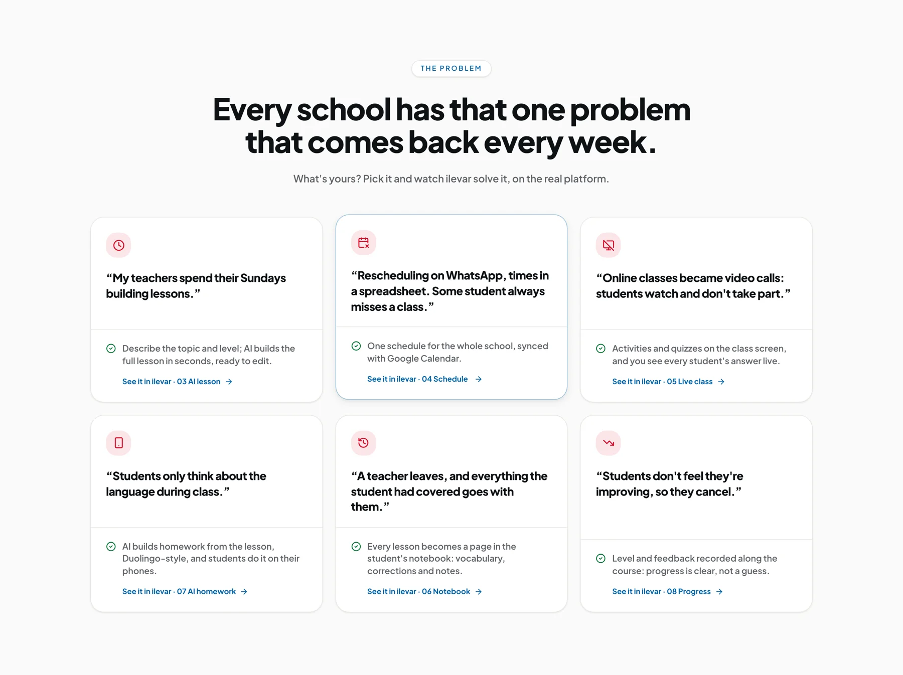
ilevar started as a marketplace where students found teachers. It is now built for the people who live with these problems: school owners and independent teachers, who need one place to teach and to run the school.
One person, the whole loop
The bet behind ilevar is that AI should do the preparation and a person should do the teaching, and that what connects them is context: the AI works from what this class actually covered. My job is to make that bet usable. I work on it as a UX Engineer, which here means there is no handoff. The person who maps the flow also draws the component, ships it, reads the ticket when it confuses someone, and watches the recording to see why.
- 01
Figma
Tokens, components and full screen patterns, each with its real states: default, empty, saving, error.
- 02
Build
The same structure in code: atoms, molecules, organisms. Dependencies only point downwards.
- 03
Code
Next.js, React and TypeScript in production, including the live classroom and the billing flows.
- 04
Support
An in-product help widget with guides, a changelog and tickets that reach me with context attached.
- 05
Experience
User flows, states and edge cases mapped before screens, and revised with what support and recordings show.
- 06
Clarity
Microsoft Clarity heatmaps and recordings, loaded only after the visitor consents.
One loop, two people, one shared room
Before drawing screens I mapped the product as a single loop seen from two sides. The teacher's path and the student's path only truly meet in one place, the live room, so every other screen is judged by one question: does it get this person into the room prepared, or does it carry something useful out of it?
Before class
In class
After class
Teacher
Open the library
/dashboard/library
Describe the lesson in one line
/lessons/templates/new
Review and prepare the plan
/lessons/:id/prepare
The live room: video, the activity and chat on one screen
/room/:lessonId
End the class
Summary, notes and attendance
/lessons/:id/summary
Send homework from the lesson
/dashboard/homework
Student
See the next lesson on the dashboard and join when the room opens
/dashboard
Read the lesson summary
/lessons/:id/summary
Do the homework on the phone
/dashboard/homework
Find it later in the notebook
/dashboard/book
Mapping it this way exposed where context was being dropped. The lesson summary, the homework and the notebook all sit after the room, and all three are built from what happened inside it. That is why homework is generated from the lesson that just ended and not from a generic bank, and why each lesson becomes a page in the student's notebook that the next teacher can open.
The full map lives in the repository as a document with flowcharts for every role (visitor, student, teacher, school owner, admin), the screen inventory, and a confidence level for each part: what is confirmed by routes and guards, and what still has to be checked in a browser.
Designing the moments when the room is not available
A room link gets shared, bookmarked and opened at the wrong time. Most of the experience of a live product is decided in those moments, so I designed the states before the happy path: a lesson is scheduled, live, completed or cancelled, and each visitor to a room link gets an answer that makes sense for where the lesson is and who they are.
Lesson lifecycle
Scheduled
class created
Live
room started
Completed
class ended
Cancelled can be reached from Scheduled or, in exceptional cases, from Live.
| Someone opens a room link and… | The product… |
|---|---|
| Not signed in | Sent to login. |
| Signed in, but not part of this lesson | Sent to their own bookings. |
| The lesson has already finished | Sent to the lesson summary instead of an empty room. |
| A student arrives before the room opens | Back to the dashboard with a "room not open yet" notice. |
| A participant arrives inside the entry window | Joins the room. |
The rule behind the table is that nobody lands on a dead end. A finished lesson leads to its summary; a student who is early is told the room is not open yet; someone who does not belong is taken to something that is theirs.
The AI output is a draft, and the interface says so
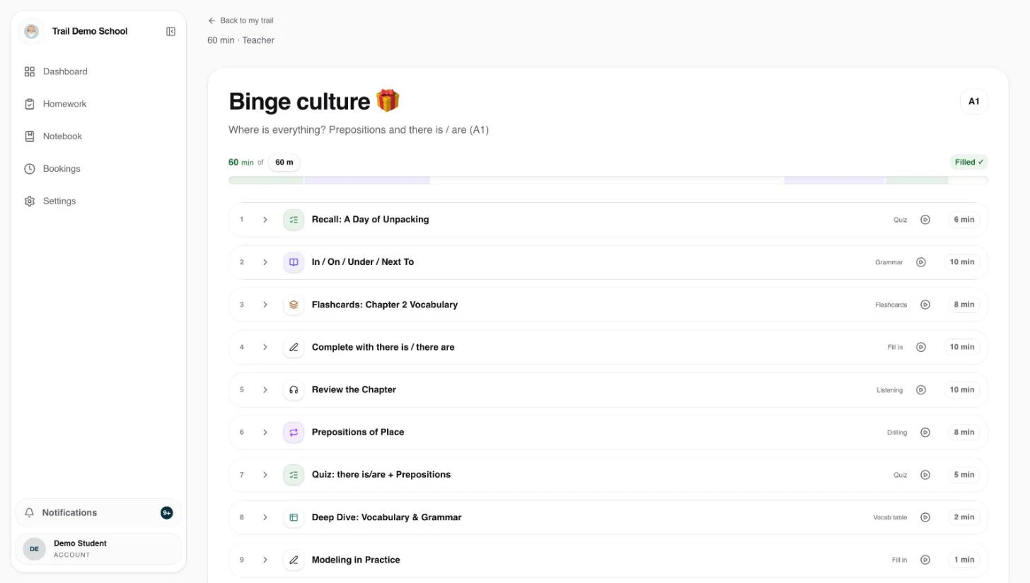
The teacher gives a topic, a level and a duration, and the AI assembles a timed plan. The decision that shaped the screen was what happens next. A generated lesson that goes straight to students would save the most time, and it would also remove the teacher's judgment from the one place it matters. So the result lands as editable steps, each with its type and minutes, under a line that reads "Lesson ready. You review it and decide what stays."
A design system that matches the code, token for token
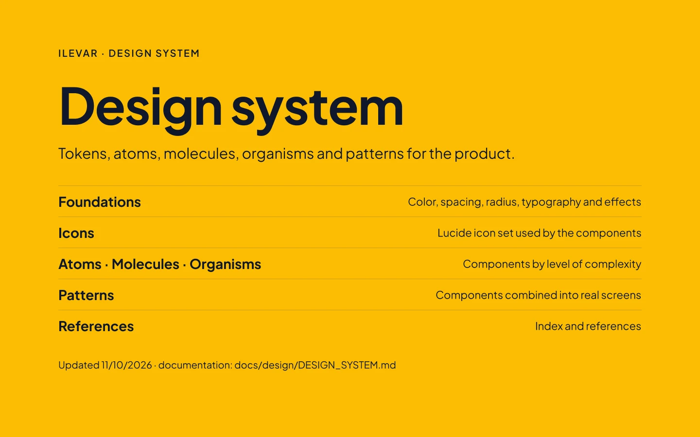
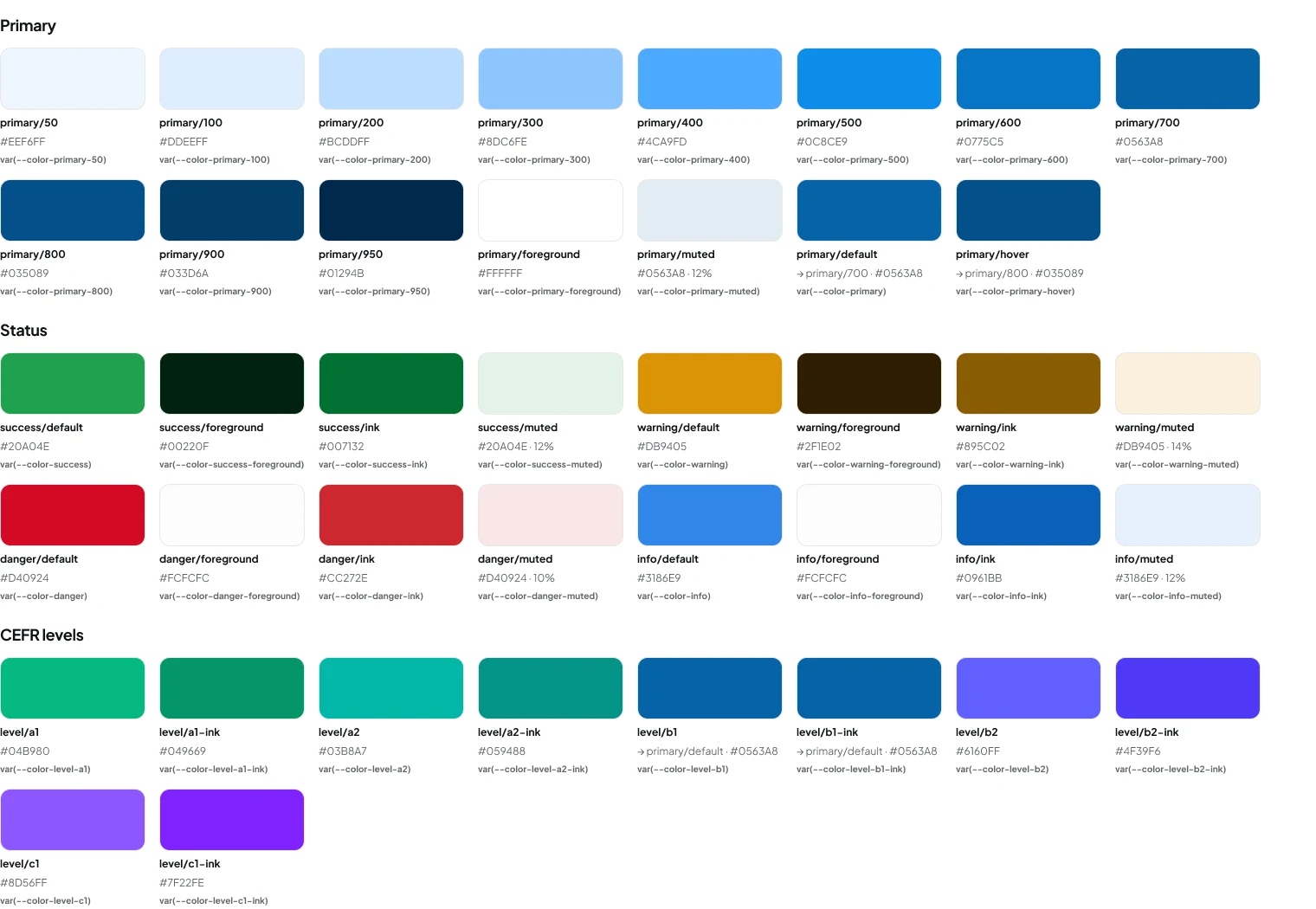
The Figma file is organised the way the product is built: Foundations, Icons, then Atoms, Molecules and Organisms, then Patterns, where components are combined into real screens. The colour collection holds 134 tokens, and every one carries the CSS variable it maps to, so a swatch in Figma and a class in the codebase are the same thing with the same name. Aliases are marked, so it is visible that the focus ring is the primary blue and not a second blue that happens to match.
I keep the file honest by reconciling it against the code, not the other way round. The stylesheet is the source of truth; when the two disagree, the inventory in the repository says which token is real, and the Figma variable is fixed to match. The cover of the file carries the date of the last reconciliation.
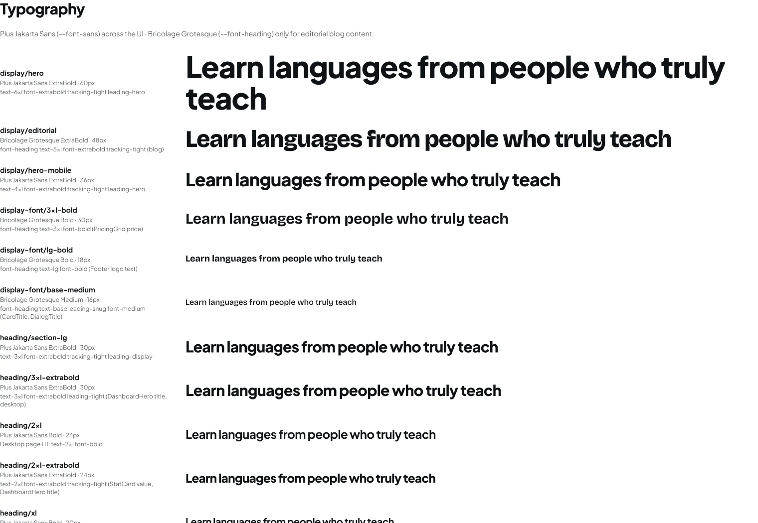
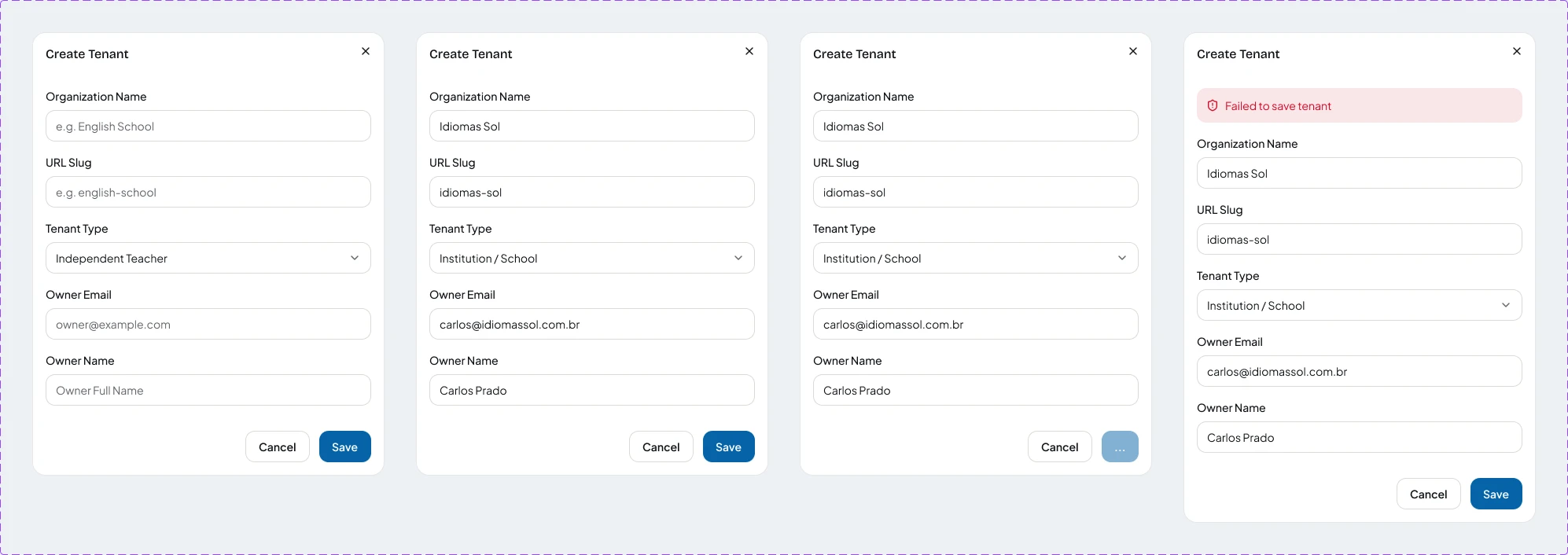
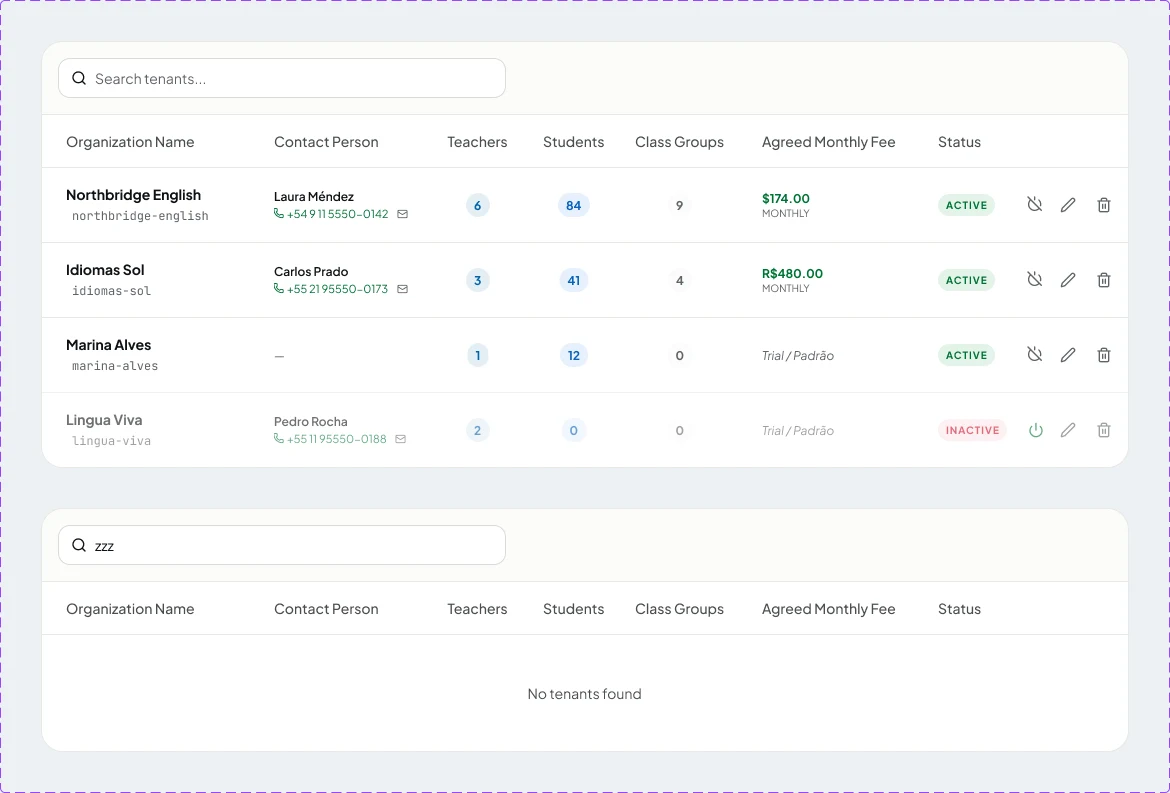
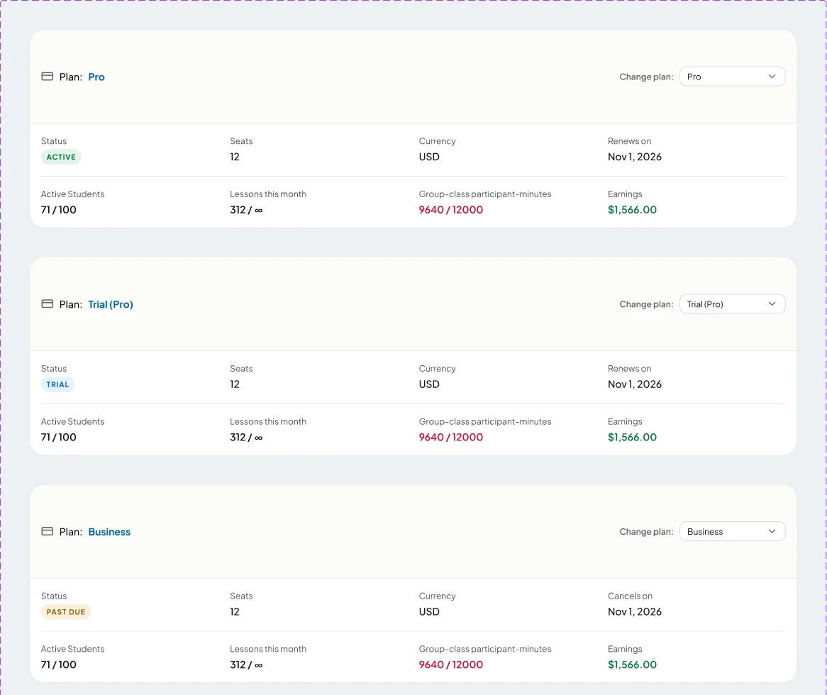
Patterns are drawn with their states, not just the happy path. A table has its empty state next to it; a dialog has its saving and error versions. That is what makes the file useful to build from: the awkward cases are already decided.
Rules that are tested, not remembered
In code the system is 32 atoms, 14 molecules and 12 organisms, with one rule about direction: organisms may use molecules, molecules may use atoms, and nothing in those layers imports feature code. The tokens live in a single stylesheet, which is the source of truth for both the app and the Figma file.
The accessibility rules are enforced by tests. Every colour pair the interface renders is checked against WCAG AA, calculated from the real stylesheet. The brand blue, #0563A8, carries white text at 6.26:1 and is dark enough to work as text on a light surface too, so it needs no separate ink token. When a token changes and a pair fails, the fix is to change the token, not to lower the threshold.
- 32 · 14 · 12
- atoms, molecules, organisms
- 113
- design-system assertions in 5 test files
- 6.26:1
- contrast of white on the brand blue
- 26
- end-to-end specs covering the main flows
Support is part of the interface
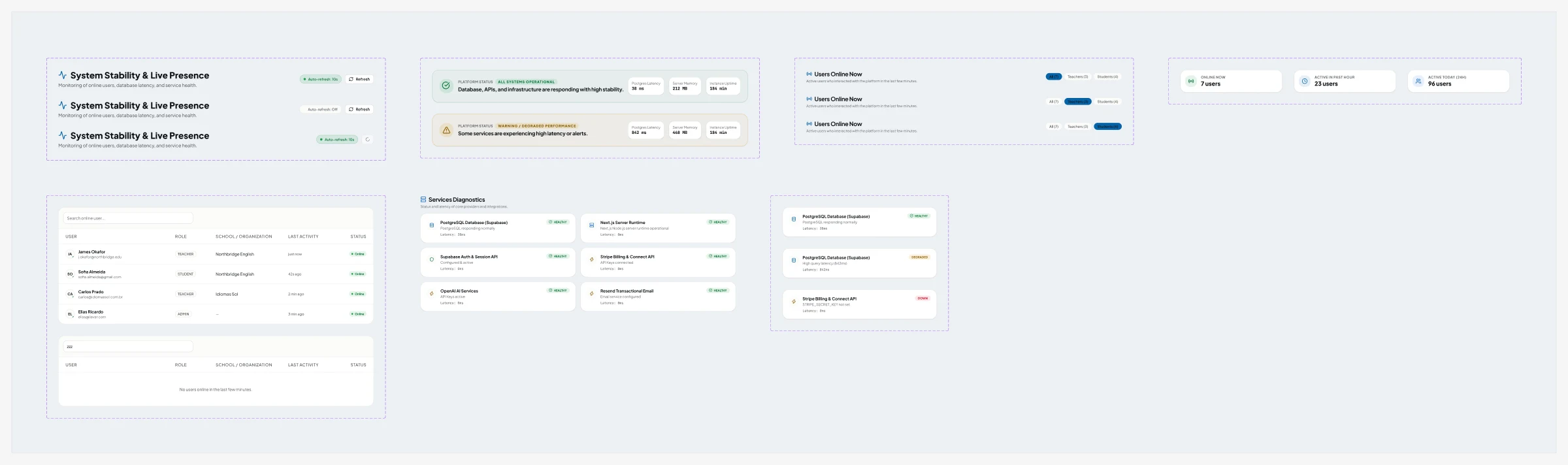
Teachers and school owners have a help widget inside the product with three things: short guides, a changelog of what shipped, and a ticket form. A ticket goes to one of four queues (technical, pedagogical, financial or feedback) with a severity, and it automatically carries the page the person was on and their browser. I do not have to ask "where were you when it happened?".
Because I am also the one who answers, the ticket and the fix sit with the same person. A confusing screen is something I can redraw and ship, not a request I pass along. The public site makes the same promise to schools: every issue is followed through, and they are told when the fix is live.
What 30 days of Clarity say, and what I do about it
Microsoft Clarity runs on the product, loaded only after a visitor accepts analytics in the cookie banner; someone who picks "essential only" is never recorded. In the last 30 days it logged 386 sessions from 77 people, with 6.5 pages and 5.2 active minutes per session. Two of the signals are good news and two are work to do.
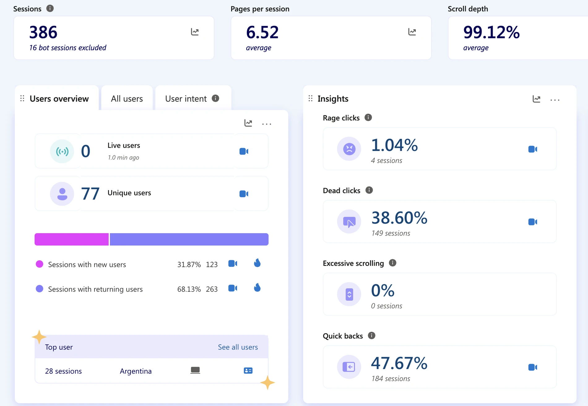
68%
Returning sessions
How I read it
263 of 386 sessions come from people who have been here before. It is used as a tool, not visited once.
What I do with it
Keep the first screen about what comes next, not about features.
1.04%
Rage clicks
How I read it
Four sessions. People are not fighting the interface.
What I do with it
Few enough to watch each recording.
38.6%
Dead clicks
How I read it
High. In 149 sessions someone clicked something that did nothing. My hypothesis: cards, rows and badges that look interactive and are not.
What I do with it
Heatmaps page by page to find which elements; then either make them clickable or remove the affordance.
47.7%
Quick backs
How I read it
High. In 184 sessions someone opened a page and came straight back. My hypothesis: some menu labels do not predict where they lead.
What I do with it
Find which navigations cause it; it lines up with the open question about Library, Lessons and Templates.
The same questions were already on my list from mapping the flows, which is what makes the numbers useful. These are the ones I am validating next:
- Whether teachers understand the difference between Library, Lessons and Templates without being told.
- Who confirms a pending booking, and whether both sides can tell pending from confirmed at a glance.
- Whether the single onboarding screen is enough for a new teacher. I built a guided tour and removed it two days later; the question it was answering is still open.
- The full class-group path on mobile: group, members, lesson, attendance, summary.
The stack, briefly
- Framework
- Next.js 16 (App Router), React 19, TypeScript
- Interface
- Tailwind CSS 4, shadcn/ui, Motion
- Data
- PostgreSQL on Supabase, Prisma, 57 models
- Auth
- Auth.js (NextAuth v5)
- Live video
- WebRTC for 1:1, Cloudflare Calls for class groups
- AI
- OpenRouter for lesson and homework generation
- Payments
- Stripe: subscriptions, add-ons and Connect payouts
- Quality
- Vitest and Playwright; 26 end-to-end specs
The repository has more than 2,500 commits and 680 merged pull requests since May 2026. I use Claude Code as a pair for refactors and for keeping token usage consistent across the codebase; the design decisions and the review are mine.
Design, code and support, from one person
ilevar is how I like to work: close enough to the code to ship the component, and close enough to the users to hear when it fails. If that is the kind of UX Engineer you are hiring, let's talk.